Disney’s 12 classic principles of animation from Ollie Johnston and Frank Thomas’ The Illusion of Life are mentioned in nearly every article about interface animation. Often without going into much depth as to why these are something web designer should care about, which leads to some doubt as to whether they’re actually of any use to us.
We’re not animating dancing brooms in feature films here. We’re designing interfaces for apps and websites. Do these principles really have anything at all to do with Interface animation?
The answer is yes. They really do.
Even when our animations are primarily there for UX purposes (As discussed here and here). Even when our animations are only a fraction of a second long. Focusing on animation’s purpose doesn’t negate the value of classic animation principles.
They teach us how to communicate with animation
Every time you animate an object on screen, it says something. It’s human nature to assign meaning to why something is moving based on our experience with real-world physics or by anthropomorphizing the objects that are animating. Good UI animation takes advantage of that opportunity to communicate something meaningful, not leaving it up to chance or software defaults.
The 12 classic principles break down how to communicate with animation and how to control what it conveys to viewers. Timing and Spacing explain how to express weight, emotion, causality, and more with our animation choices. Follow-through and Anticipation explain how energy can be implied across movements. Squash and Stretch shows how manipulating the shape of an object can suggest traits about the material it’s made of. Using these concepts well can be the difference between animation that’s effective and animation that merely distracts.
Designing animation is a lot like designing typography. Type can just be there for the utility of reading and nothing more. Or it can be taken further and intentionally designed, selecting typefaces that share a common voice with the content. The same goes for interface animation. You can include animation purely for its intended UX purpose and leave it at that. Or you can take it further and intentionally shape it to work in harmony with the rest of the design. Designing this level of detail is what separates great design from average design, both in typography and animation.
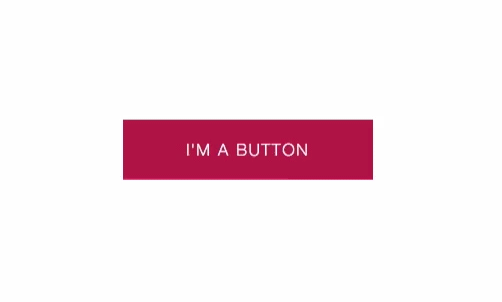
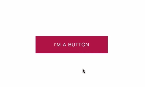
The concepts in the 12 principles help explain why small changes to an animation can result in big changes in how it is perceived. Using different easing on a button can influence what it’s like to interact with it:
Just like using different typefaces for a headline can influence the reading experience:


An appreciation for what can be expressed with easing is a big benefit of understanding the 12 classic principles. The principles of Timing, Spacing, Follow-through, Anticipation, and Exaggeration can all potentially be expressed with the easing you choose for an animation. These are factors that affect the way that weight, energy, and emotion of your animation are perceived; all potentially wrapped up in one property choice. This is why taking advantage of custom easing options (like cubic-bezier functions in CSS) is so important. Limiting yourself to only “ease-in” and “ease-out” arbitrarily limits your animation’s capacity for expression.
We refer to these Disney greats not because they tell us how to make cute characters dance around, but because they teach us how to have finite control over movement and expression in animation.
They give us a vocabulary for discussing animation
The 12 principles gives us specific terms and concepts to discuss animation in a useful way. This is something that is especially lacking in web design since the web was a purely static medium for so long. We’ve never had to discuss animation in detail at all until recently.
Acting out an animation or prototyping animation are both effective ways to show animation ideas. But at some point you’re also going to have to discuss these ideas with words in writing or conversation. Without a shared vocabulary around animation, this can be difficult and time consuming.
Statements like “that animation needs to pop more” are difficult to discuss or act upon in any meaningful way. It’s like saying “that blue needs to be more purple-blue-ish to stand out”. It could mean almost anything, and everyone in the room likely has a different picture in their head of what it means. A lot of additional explanation will be necessary to get everyone on the same page.
On the other hand, Statements like “The follow-through on that animation needs to be toned down.” are a lot more specific and actionable. Everyone on your team that’s familiar with the definition of follow-through knows exactly which aspect of the animation is being discussed.
Knowing the 12 principles gives your team the foundation of a shared and specific vocabulary to make design decisions faster. You’ll need to develop your shared vocabulary beyond just what’s in the 12 principles to discuss all the aspects of interface animation, of course. But building off of their existing terminology saves you the time of coming up with something entirely from scratch.
But we have to take the classic principles one step further
As much as the 12 classic principles of animation can teach us, it’s important to remember that these principles were written for a different time and a different medium. Interface animation focuses on having purpose and utility more than storytelling. Our job is to learn from these concepts and expand upon them for the context of the modern web.
Not all of the 12 principles apply equally to work on the web or to modern tools. Some matter more than others for animating interfaces. A solid understanding of Timing, Follow-through, Appeal, Anticipation and Squash and Stretch will be useful in web design, for example. While concepts like Staging and Solid Drawing, however, are mostly irrelevant.
We have different goals and use different tools than those Disney animators, so don’t take all these principles at face value. It’s good to have opinions on which classic principles matter most to you. Of course, that requires experimenting with the principles and trying them out for yourself. Which is something I encourage all web designers and developers to do. More experience with the classic concepts of animation will help you design and build better web animation. The more you know about what’s come before, the better prepared you are for iterating on it to make something new.
1. This article is also posted on Medium for kicks.
2. Thanks to Sarah Drasner for her help reviewing this article.
3. If you liked this article, you’ll also like the UI Animation Newsletter.