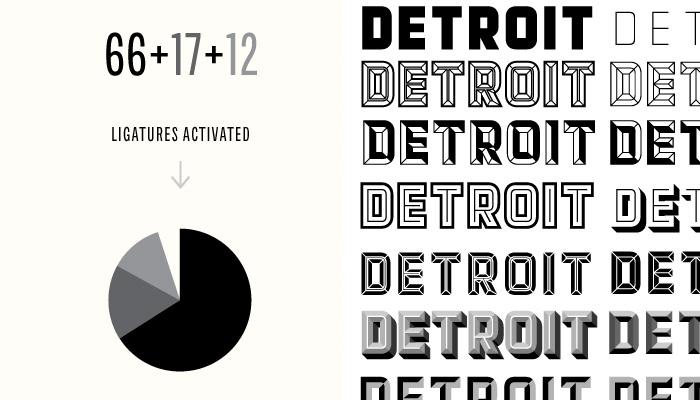
Sometimes it’s easy to forget that fonts aren’t just a collections of glyphs that just work one way. You might expect to find some fancy alternates or ligatures, but that’s often the extent of our expectations. I’ve come across two this week that reminded me how versatile fonts can be just by changing things up a tiny bit. It’s amazing what clever type designers can come up with!
Detroit is not only really beautiful, the different parts of the font family can be layered up and pieced together. It’s almost like typography lego. Chartwell almost looks like magic the way it makes charts out of ligatures. Both are pretty darn cool!
To see chartwell in action, even on the web, check out this video on CSS-Tricks.
If you know of any similarly system-like fonts, please share!

