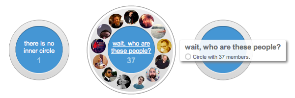
That’s what I said when I first started using Google+, and I was even serious. The animations on the circle editor page had me hooked in a second. How could you not have fun categorizing all your friends when the circles spin and pops out little green +1 circles as you add them?
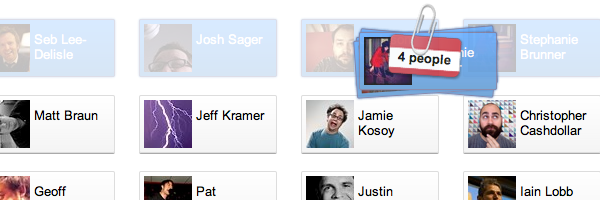
My favourite is the one pictured above: select multiple people and they arrange themselves in a nice little stack with a paperclip and a label. It has all the markings of great UI animation: It doesn’t get in your way; it gives you useful information; and it adds an element of fun. Love it!
Even with the recent design upgrades they’ve been rolling out, I was surprised to see something like this come from Google.
After using it though, I wasn’t surprised to see quotes like this in an interview with Andy Hertzfeld:
Then there was the core idea of the circle editor which was trying to make that fun, engaging, something that you would want to do because it can get tedious. So, we wanted to reward the user for doing it, putting a smile on their face and trying to make it so enjoyable they keep on doing it. (full article)
(Any Hertzfeld is one of the designers who worked on that area of Google+ and also happens to have a pretty legendary career history.)

I’d say they accomplished what they were going for. It’s also interesting that iteration and trying ideas quickly are two things he mentions when talking about designing the circle editor page. This kind of detailed and delightful animation doesn’t happen the first time around. It takes a lot of trial and error to get UI animation that “just works”.
If you read more, he also says that they aren’t done. That they’re still gathering user feedback and making changes based on it. I’m curious to see what changes or additions they’ll make.
Go ahead and add the circle editor to the list of ways Google has impressed me with their design choices lately!
