I interviewed the wonderful Eva-Lotta Lamm about sketching interface animations for the UI Animation Newsletter. She had so much helpful advice that I had to post it here too:
Q1 — In your workshops you outline a very streamlined approach to sketching interface animations. Can you tell us more about your approach and why it’s so effective?
Sketching out ideas for interactions can be a bit overwhelming when you first try. There can be a lot of elements to capture and think about at once. I like to describe an interaction as a combination of three layers that come together. Like that, I can think about each layer separately and it gets a bit easier to process.
The three layers are: Trigger, Action and Quality. Here’s what each entails.
1.Trigger
The trigger is what starts the interaction. There are two types of triggers: user actions and system events. System events are things like ‘a notification coming in’, ‘access denied’, ‘download finished’, ‘new email arrived’, etc. User actions are anything that the user does to manipulate the interface. On a simple level this is just a click or a tap. Touch interfaces opened up a whole range of interesting user actions in the form of various touch gestures, like swiping, pinching, double tapping, long pressing and even the recent addition of 3D-touch on the iPhone. With new technologies for gestural interfaces and the internet of things that will allow us to interact with objects in many different ways, these types of triggers will get more diverse and more important to think about.
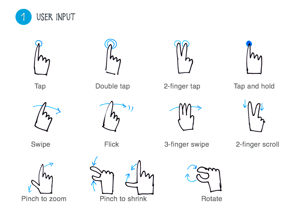
Simple sketched library of common touch gestures.(By Eva-Lotta Lamm)
2. Action
The action is what actually happens as a response to the trigger. Elements on the screen can appear, disappear, change position, get bigger or smaller or change shape. A good place to start sketching an action is thinking about the ‘before’ and ‘after’ state of the interface. What did the interface look like before the trigger, and what does it look like in the end?
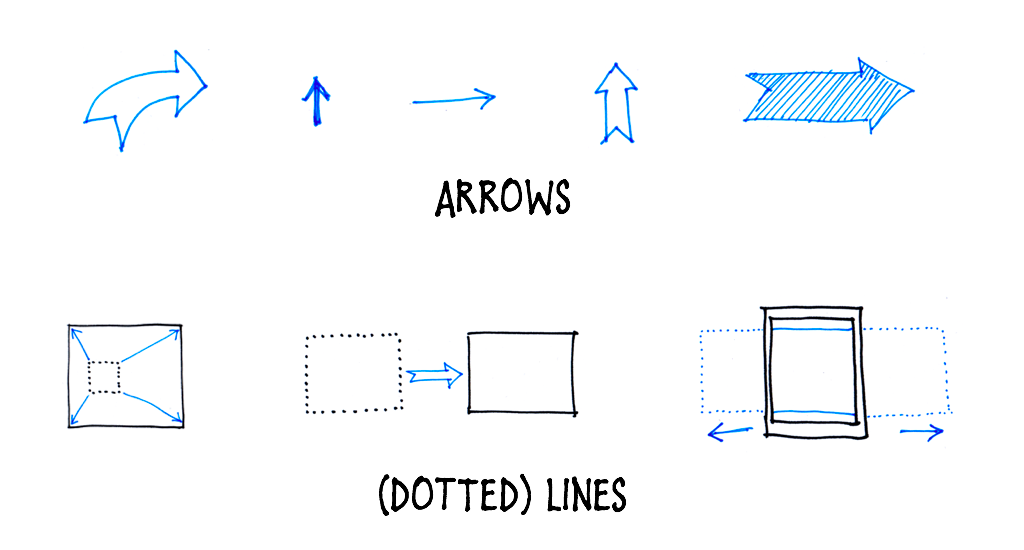
Arrows and dotted lines are very helpful to express movement, change in state and ‘hidden’ parts of the interface.(by Eva-Lotta Lamm)
3. Quality
This layer is very closely related to the action. It is concerned with the ‘How’. How does the action get performed? Are elements moving fast or slowly, do they have easing, do they bounce, or shake? Language is often a very helpful way of capturing the how. We usually think of sketches as just visuals, but labels and annotations are actually crucial and powerful part of a sketch. Often there is already some pretty specific language in place on the development side to describe the ‘how’ of transitions and animations in the form of built-in easing curves of an animation framework. Check with your developers or prototypers how they name things so you can start to speak the same language in your sketches.
Thinking through the layers: Only sketch what you need
Depending on what kind of interaction you are trying to think through or explain, some layers might be more important than others. For example, if the trigger is just a mouse click or a tap, it is so simple and well understood that we don’t even need to sketch it. When we are developing a gestural interface though, using a quite unusual and specific gesture to trigger an interaction (e.g. systems like the LeapMotion or an IOT object that can be manipulated in novel ways), we want to focus more on this part and express it in our sketch.
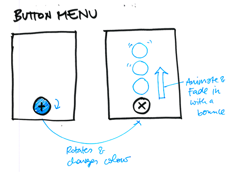
Sketch of an animated menu that expands on tap. It’s not necessary to sketch the tap so all the focus can be on describing the animation. (by Eva-Lotta Lamm)
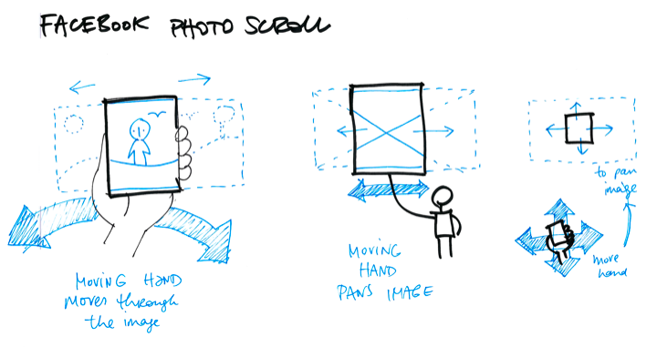
Caption: Several variations of sketching Facebook’s photoscroll feature that allows to pan through a large image by moving the phone in space. Here the trigger is the novel aspect and therefore the focus of the sketch (Note: Eva-Lotta didn’t design this interface. These sketches are just for demonstration purposes.)
Different sketches for different aspects
If an interaction is quite complex and a lot of things are going on at the same time, you might want to make several sketches, each focussing on one particular aspect.
A single sketch can get very crowded and hard to ‘read’. By splitting up the interaction into several sketches you can avoid visual overload. You can also think through variations for individual aspects more easily when they are expressed in their own sketch.
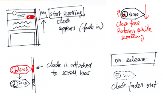
Sketches of scrolling the feed in the Path iPhone app. There are a lot of things happening at once, so each sketch explains a different aspect of the interaction (Note: These sketches are just for demonstration purposes.)
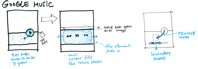
Another example of splitting an explanation into multiple sketches: Google Music player on Android. (Note: Eva-Lotta didn’t design this interface. These sketches are just for demonstration purposes)
Q2 — What advantages are there to sketching animation ideas as opposed to jumping right into prototyping or production code?
Eva-Lotta: Sketching doesn’t replace prototyping. As sketching is faster than prototyping, it is an ideal preparatory and complementary way of quickly capturing and communicating what you want to prototype. I use sketching a lot when brainstorming and refining ideas with colleagues. When I am working with a dedicated prototyper, sketching is very helpful to communicate my design ideas to her and to discuss alternatives. When I am prototyping myself, I usually sketch to capture a list of first ideas to prototype.
I also find it very helpful to sketch good examples of existing interactions and transitions from other products. The act of sketching helps to really understand and learn from good existing examples by breaking down what is happening and how and it can be an interesting starting point for your own design explorations.
Q3 — Is there a particular time in the design process when sketching interface ideas can be especially useful?
Eva-Lotta: Sketching is a useful tool, whenever we want to explore and communicate design ideas on a conceptual level. As sketching is quick and relatively low fidelity, it forces us (and therefore helps us) to think on a more conceptual, structural level and not to get lost the details before having solved the actual problem. This is especially helpful at the beginning of a project, but as we iterate throughout the process, it can become useful at various points, whenever we need to quickly explore alternatives before committing which one to pursue further.
Once the concept and design becomes more detailed and refined, it is time to move to more high fidelity tools like wireframing, prototyping and detailed visual designs.
Q4 — Where can we find you and details about your upcoming book online?
Eva-Lotta: I am currently writing a book on the wider topic of sketching interfaces. You can sign-up for updates about the book and upcoming workshops at sketchinginterfaces.com. If you are interested in organising a sketching workshop for your company or conference, please get in touch.
And of course you can follow me (@evalottchen) on Twitter or Instagram.
This interview was for the UI Animation Newsletter. Subscribe to get web animation news and tips straight to your inbox each week!
