I’m so happy to see more and more companies sharing their design guidelines and style guides publicly. Especially when these guides have entire sections dedicated to animation!
Animation absolutely belongs in your style guides. It’s the perfect place to document what animation decisions have been made, and to lay a foundation for making cohesive animation design choices in the future.
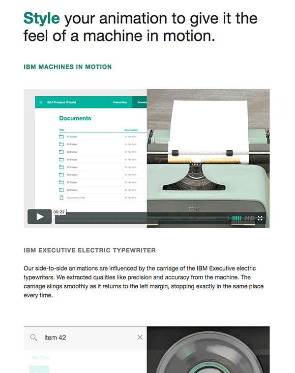
A key way to do this effectively is to include a section on the style of animations that embody your brand like IBM does in their most recent Design Guidelines. Their Style section goes beyond listing easing choices or code examples and explains, with references, the style of motion that all their their UI animations should aim to evoke. Essentially, the way their brand should be expressed in motion.
They use real-life metaphors and descriptive language to define what real-life objects they are drawing inspiration from and, even more importantly, why this style of motion fits their brand. Yes!
Part of the animation style section of IBM’s Design Language guidelines
Including an animation section in your style guide isn’t just for big companies. Any brand or product using motion in their design should have it. And if you include a section on what style of motion best embodies your brand and why, all the better! This sets you up for creating a suite of cohesive animations as your brand or product evolves, not just repeating the same bits of motion across the board.
(Also, if you’re stuck on how to express your brand in motion or how to get animation into your style guide, get in touch. That’s exactly the sort of thing I help my UI animation consulting clients with!)

