In web design, our processes tend to revolve around static deliverables which can make it harder than it needs to be to use animation in our designs. Static comps alone just aren’t enough to properly communicate and evaluate animation ideas. Creating motion comps can make sharing and communicating animation ideas so much easier.
An animated deliverable
Motion comps (also called animatics or motion mock-ups) are usually video representation of UI animations. They’re made with a timeline-based tool like After Effects, Adobe Animate CC (Flash), Hype, or similar tools, and are used to explore the details of how a particular animation might play out.
The most useful things about motion comps is how they allow designers and developers to share the work of creating animations. (Instead of dumping all the responsibility of animation on one group or the other.)
Share the work
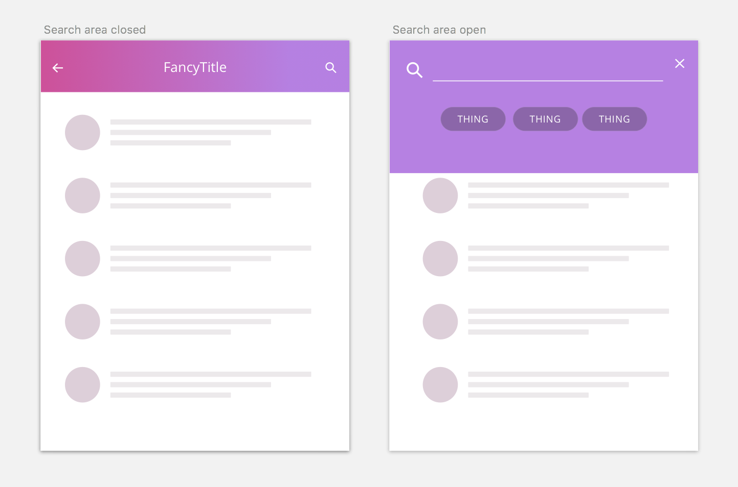
Static comps alone can’t always cover animation in enough detail. For example, imagine you’re a designer who designed these two states for a search area: the open state and the closed state. Perfect, we have the two states. Send it off to the developers to build it.

But wait, what happens in the middle? How does it actually get from the closed state to the open state? There are 8 different things that change between these two states. There are a lot of different ways this animation could go down.
In this case, the static comps have failed this team. The developer on the other end of the handoff now has to figure out all of those details herself, on top of writing the code to make it happen. Handing off just the beginning and end states assumes the developer has the time and interest to fill in all those blanks themselves. This assumption can lead to frustration for everyone involved.
Motion comps are one way to help avoid this situation.
Motion comps to the rescue
By plotting out the animated transition from the closed state to the open state in a timeline-based tool, our designer above could handoff the logic of how that transition happens in addition to what the two end states should look like. They could even have discussions with the developer who will be coding it along the way to make the design decisions even more collaborative.
All those ambiguous questions about what happens in the middle now have answers: The arrow and title fade out together as the background area grows taller and its gradient morphs colours. Then the search icon wipes across the screen, the text area fades in, and the tags fade in with a stagger.
For an even smoother handoff, the designer could share the durations, easing curves, and repeat counts used for the animations as well.
By using motion comps, our designer and developer can both have input into how the animation works, and they’ve shared the work of figuring out its details.
Couldn’t I have just made a prototype?
Yep, you most definitely could! You could also delve into the “what happens in the middle?” question by creating a quick interactive prototype with code or prototyping software. Some people would find that easier, some people wouldn’t. Both motion comps and prototypes can be extremely useful in the design process and you can use whichever one (or ones) that best fits your team’s style.
This article was written for the UI Animation Newsletter. Subscribe to get weekly web animation tips and resources straight to your inbox!
