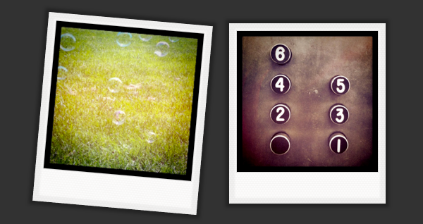
This is an example I used during a recent talk on design details with CSS3. Time didn’t allow for me to go through it in as much detail as I would have liked. So I thought it would make it into a little tutorial instead.
We’ll be making a small Polaroid inspired gallery from a few choice instagram shots. Grab the source to follow along, or grab a few of your own instagram shots to make one of your own!
Take a quick look for a preview of what we’ll be putting together.
The Basic HTML Structure
Gallery 01
And it’s very basic indeed! Just a list of linked images and very little more, but that’s all we need! In this example, my links aren’t going anywhere, but I imagine if this were a real image gallery these might link to larger versions of the photos or something else more useful.
I’ve sized my images a bit larger than I’ll be using them. Theoretically this should help them look better when they get sized up by the transition I’m using. It will depend on the browser, of course, but I’m going to go with bigger is better for now.
As we add in all the styles, I’m going to use the <a> to create our Polaroid frame around the image as well as to trigger the transitions. It’s going to be one hardworking anchor!
Making It (Look) Real
I’ve always loved Polaroids. In fact, I have more Polaroid cameras than I’ll probably ever admit. So I wanted to make these look as much like real Polaroid pictures as possible, specifically the Polaroid 600 film.
I’ve used two images just to be extra realistic: one for the photo itself, and one for the subtle diamond-shape pattern for the outer frame of the Polaroid pictures.
Here’s how we style our <a> tag to act as our Polaroid frame:
[css light=”true” toolbar=”false”]
#gallery li a {
padding:10px 10px 40px 10px;
background: #f7f6f5 url(../img/pattern-tile.png);
display:block;
/*box shadows — 2 of them!! */
-moz-box-shadow: inset 0 0 2px 8px rgba(96,96,96, 0.1), 0 0 5px 5px rgba(0,0,0, 0.3);
-webkit-box-shadow: inset 0 0 8px 2px rgba(96,96,96, 0.1), 0 0 5px 5px rgba(0,0,0, 0.3);
box-shadow: inset 0 0 2px 8px rgba(96,96,96, 0.1),0 0 5px 5px rgba(0,0,0, 0.3);
}
[/css]
The padding and background rules are pretty self-explanatory, so let’s talk about the box shadows.
I’ve set two box shadows. The first is a subtle inset shadow to replicate that little bit of a darker frame you get around the edges of a Polaroid where it’s sealed. The second is a drop shadow doing exactly what you’d expect from a drop shadow, lifting the photo from the page just slightly. (Each shorthand box shadow is separated with a comma, and we could have more than two, but we don’t need to.)
I’ve also added some styles to the images themselves to make them more Polaroid-like.
[css light=”true” toolbar=”false”]
#gallery li img {
width:200px;
border: 1px solid #dfdfdf;
border: 1px solid rgba(96,96,96,0.2);
}
[/css]
There’s a slight border around each image and the images are sized to 200px wide. That’s a few pixels smaller than they actually are, but I’ll be scaling them up a little later and those extra pixels might just come in handy.
Alright, so we’ve got a bunch of pictures that look like Polaroid. Great! We could stop there, but why not add some CSS transitions to make them a little more interesting?
Let’s Get Moving
After some playing around, I decided to make the photos rotate and scale up a little in response the mouse hovering over them. Transitions are always something that I try a few different ways first before deciding on a final behaviour. It’s hard to know what’s going to work without trying it first!
To set the transitions, we start by setting the scale and rotation for the Polaroids at the end of the transition. We’re adding this behaviour to the <a> tag because it’s acting as our frame and we want to have the entire Polaroid move, not just the inner image.
[css light=”true” toolbar=”false”]
-#gallery a:hover{
-webkit-transform: scale(1.05) rotate(5deg);
-moz-transform:scale(1.05) rotate(5deg);
-o-transform:scale(1.05) rotate(5deg);
transform:scale(1.05) rotate(5deg);
}
[/css]
We’ve added a rule to scale the image 1.05 times it’s current size and rotate it by 5 degrees when we hover over it. Notice that we’re using all the browser specific prefixes, plus one with no prefix for when these properties become standard.
If you preview the gallery right now, it leaves a lot to be desired. The images suddenly jump to a scaled and rotated state when you hover over them. It’s very jerky and unsatisfying. Adding the transition rules will fix that!
Smoothing It Out
[css light=”true” toolbar=”false”]
#gallery li {
…
/* setting the movement */
-webkit-transition:all 0.3s ease-in-out;
-moz-transition: all 0.3s ease-in-out;
-o-transition: all 0.3s ease-in-out;
transition: all 0.3s ease-in-out;
}
[/css]
We’re going to go back to our #gallery li declaration to add the transition rule. This might seem a bit counter intuitive, but the reason we put the rule here is because this is the element that we want to have transition.
We’ve add a rule to transition all properties that might change; take 0.5 seconds to make that change; and to use the built in “ease-in-out” when interpolating the properties that have changed. That’s a lot to cover in one line! Like before, we then repeat it a couple times to cover all our vendor prefix basis and one last time for the (future) final spec.
Finishing Up
So there we have it. A gallery of images all made up like Polaroids with just a little bit of animated personality to them. And it was pretty darn easy to make, too!
The Fine Print
We’ve used CSS3 transitions here, which means that at least right now, not all browsers are going to support our transition. Sites like can I use and this handy chart will help you narrow down what’s going to work where. Always think about fallbacks when you’re creating something beyond a little tutorial :)
