I interviewed the wonderful team of Nadieh Bremer and Shirley Wu about their dataviz work for the UI Animation Newsletter, and it went a little like this:
How did Data Sketches get started? Were you two already working together on other things?
Shirley: The idea for data sketches actually came about last June, when Nadieh and I were lamenting our lack of completed side projects. On a whim, I asked Nadieh if she wanted to collaborate on something (fully expecting to be rejected), and I was super stoked (and surprised) when she said yes. From there, we worked out the structure in a matter of a few days, and did our first month in July. We waited to get two months under our belt, and launched in late September.
Nadieh: Yes indeed, I’m still super happy Shirley asked, because I would’ve never had the nerve, haha. We met a few months before IRL at the OpenVis conference, but we weren’t yet collaborating on anything, just chatting occasionally on Slack.
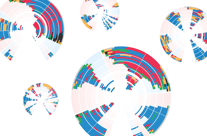
Nadieh Bremer’s Olympic Feathers visualization
What tools do you typically work with to collect your data and create your data sketches?
Nadieh: I always end up using R for the data preparation part, whether it’s to get my csv’s or Excel sheets into better shape, or to scrape data from websites. For the dataviz part it always use d3.js. Although for December I took my visual from d3 to Illustrator and combined it with some charts made in R. And for February I created a more generative art piece using HTML5 Canvas (but still some underlying things such as scales were using d3).
Shirley: I’m a mix of APIs and manual data collection. In my October, for example, I used the Youtube and Google Cloud APIs to put emojis on the Obamas’ faces. In November, I manually entered all the metadata for my Hamilton visualization, because none of it existed digitally. I use a lot of Node packages to access the APIs and clean the data. For visualizing, I primarily use D3.js and React.js, though in my latest March data sketch, I experimented with Greensock.
When in your design process do you start thinking about animation? Do you know from the outset that a certain kind of data might lend itself to animation?
Nadieh: No actually, at the start of a visualization I think about the main abstract shape that I want to mold my data into. If the static visual form is a bad one, no manner of interactivity or animation will make it good. However, a good visual form can become awesome if you then start adding animation and interactivity. When I have my data in a rough static form on the screen that I’m happy with, then do I start thinking about how I can make more details available through animation. For example, in October I had a network of family links between European Royal houses. When you hover over one of the people in the network, their “6-degrees of separation” lights up in a staggered manner to see how much that person is intertwined in the family tree.
Shirley: I also don’t start thinking of animation until I have the rough set of visuals figured out. Like Nadieh, my primary concern is to make sure the visuals I use make sense for the data (to the best of my ability), and I use animations as a way to transition between states or connect different sections/concepts with the same visuals. In that sense, animation for me is like the sprinkle on the cupcake, applied towards the end to give a delightful finish.
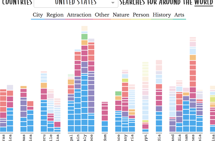
Shirley Wu’s Adventure Is Out There visualization
Where have you found animation to be most helpful when creating data visualizations?
Nadieh: For me it seems to come down to two main things; like I explained above, animation can reveal more details about the data for which there is no place in the static visual. But I also use it to increase the delight in a way, to make it more engaging to interact with the data. For January I visualized all fights occurring in Dragon Ball Z. When you hover over a fight, the fight increases in size, characters moving apart, and providing extra detail. The short animation there is meant to make it actually a bit more fun to hover over the fights and explore.
Shirley: I actually try to minimize my use of animation, because I think it’s one of those really fun things that is easy to abuse and then suddenly everything is animated. So when I do use animation, it’s to emphasize the importance of something – transformation of a visual element as the user scrolls down the screen, for example. Ever since I attended Val and Sarah’s Web Animation Workshop though, I’ve been thinking about how to thoughtfully use more animation in my visualizations. One of the things I’ve tried for my March data sketches is to use Greensock’s Timeline to step through “scenes” that explained different parts of my visualizations to the user. I like that it takes less screen real estate, though I am a bit concerned that the user won’t know to step through my “scenes”.
If you’re interested in data visualization I highly recommend checking out Shirely and Nadieh’s Data Sketches project. They put together two different takes on a data theme each month.
And if you want some hands-on training in web animation to use in data visualization, check out the Web Animation Workshops series.